Bookie
Overview
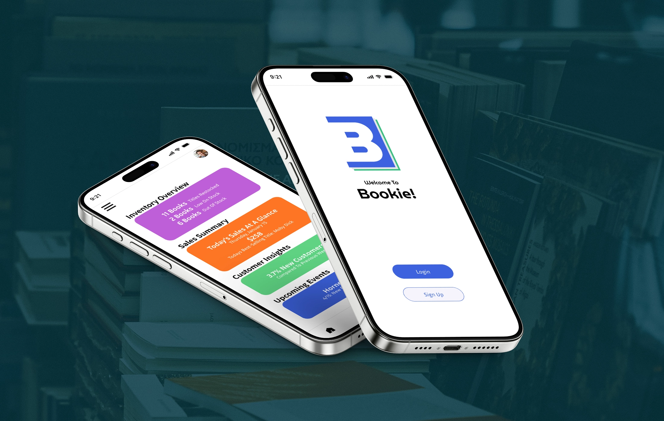
Bookie is a mobile management app for independent bookstore owners and staff. The core problem: small bookstores typically manage operations across disconnected tools, leaving owners without a unified view of their store. I joined a four-person team as the UX/UI designer, responsible for the information architecture and wireframe design. For this case study, I independently rebuilt the high-fidelity design to refine the visual system and push the product further.
Information Architecture
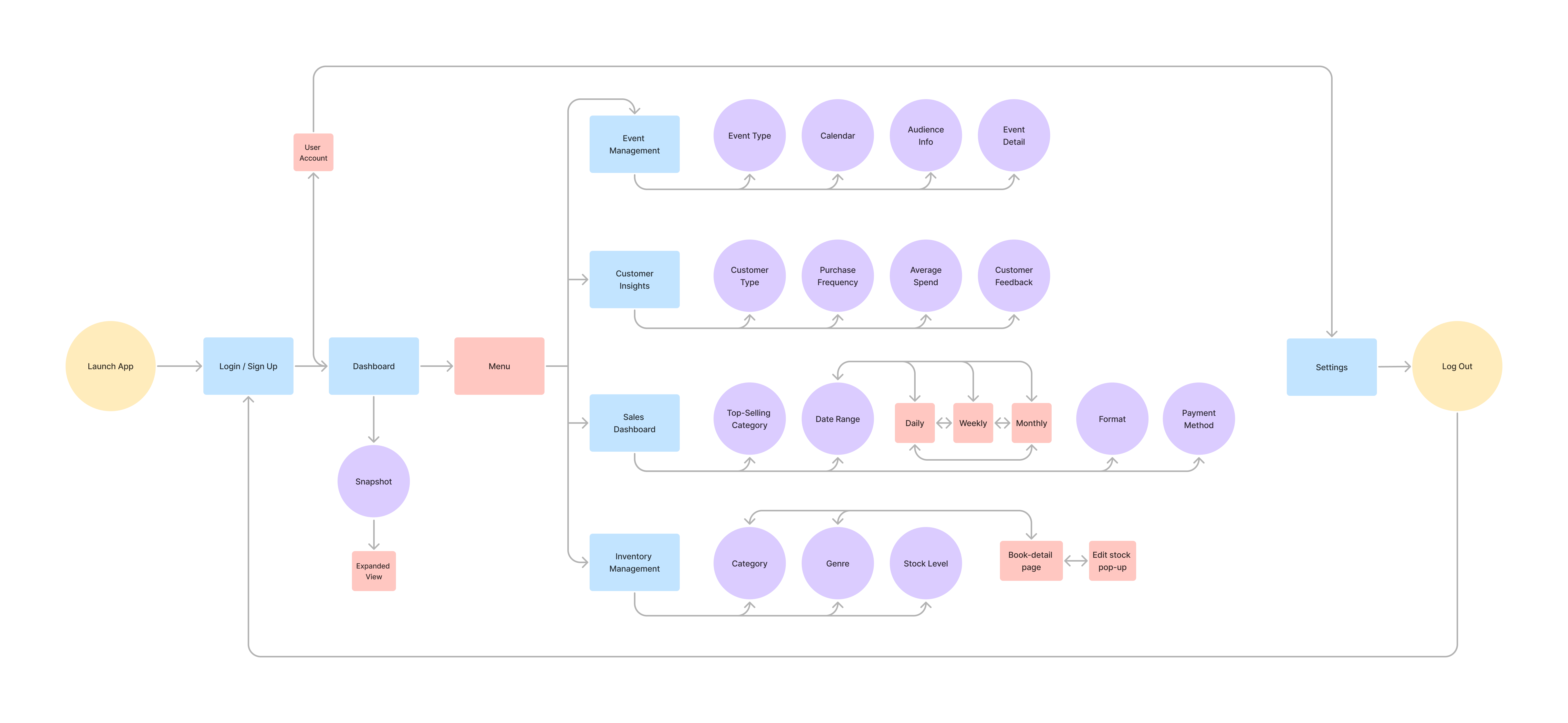
Through team discussion, we defined four core modules to anchor the app: Inventory Management, Sales Dashboard, Customer Insights, and Event Management. From there, I developed the full information architecture by defining the navigation structure, mapping relationships between modules, and breaking each module down into its pages and sub-flows.
Wireframe
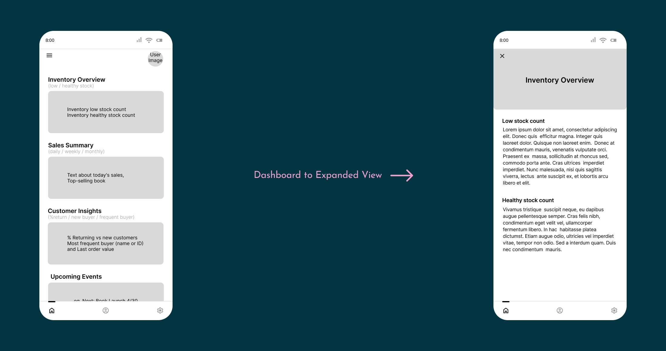
The app is anchored by a Dashboard that gives users a quick read on the store's daily state, aggregating key signals from each module.
Two Navigation Paths
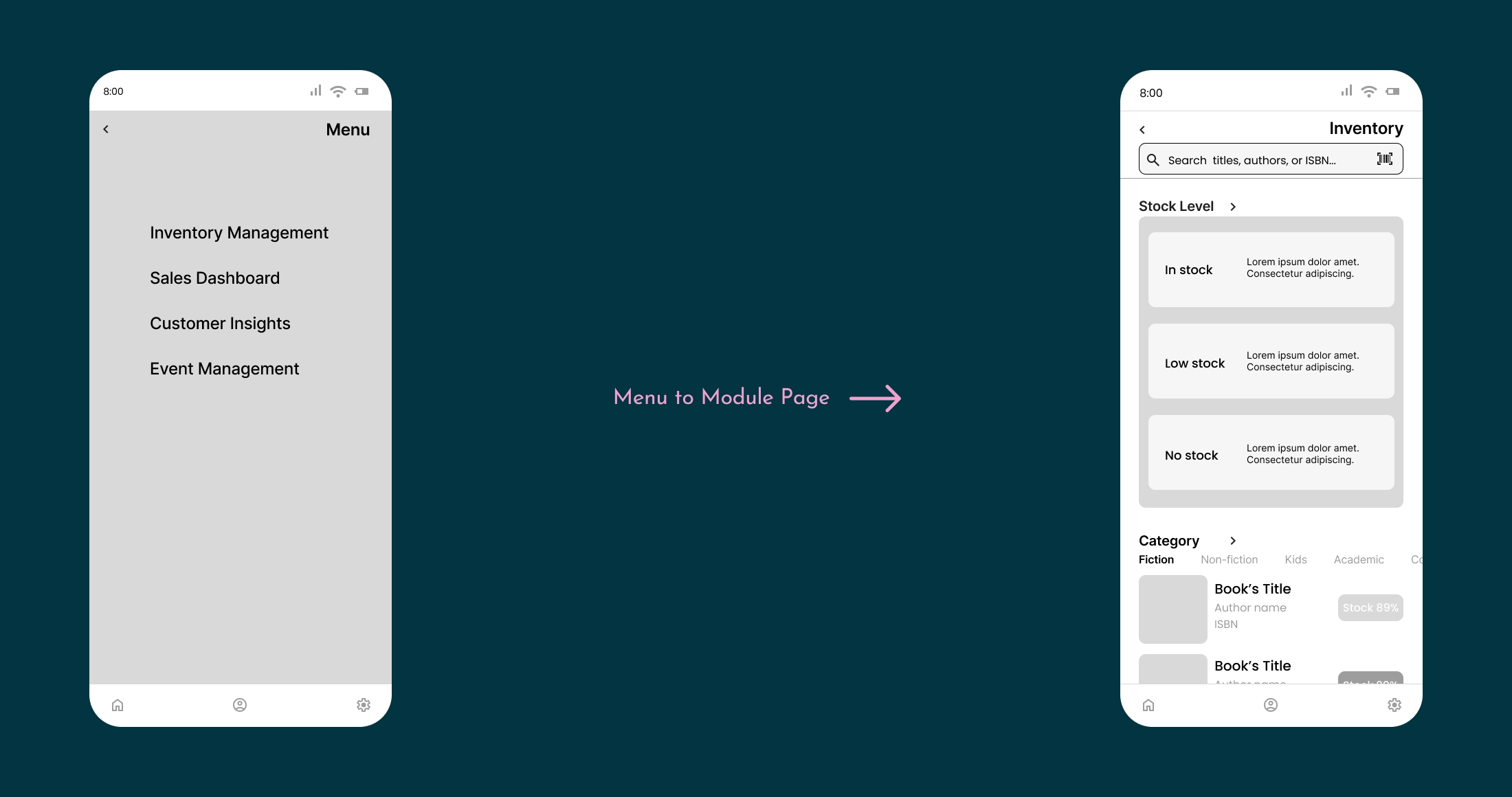
Two paths support different use cases: Dashboard cards open module summaries for quick review, while the side Menu opens full module pages for hands-on operations.
Four Modules
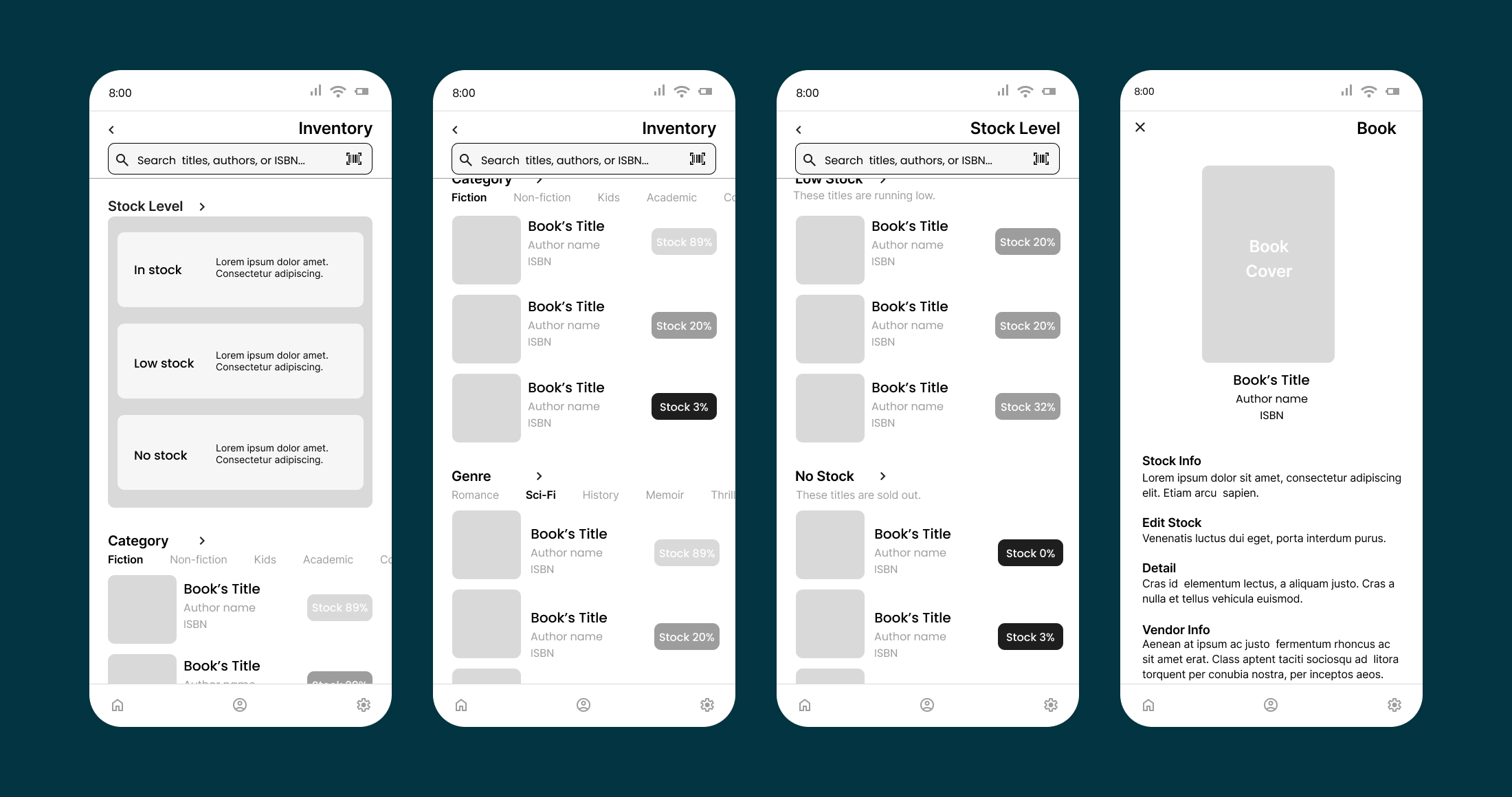
- Inventory Management: Through brainstorming and early structural sketches, I prioritized stock status over alphabetical or category sorting so urgent restocking needs surface immediately.
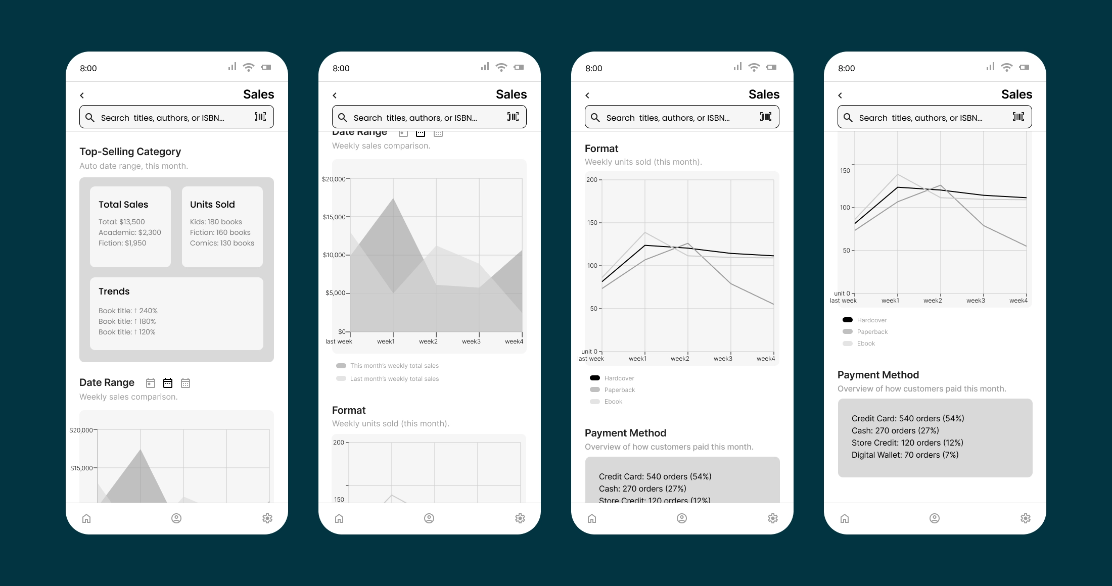
- Sales Dashboard: I structured the page from high-level overview to granular detail, starting with top-selling categories before breaking down by time, format, and payment. The data and charts are illustrative, designed to show how the information hierarchy would work in practice.
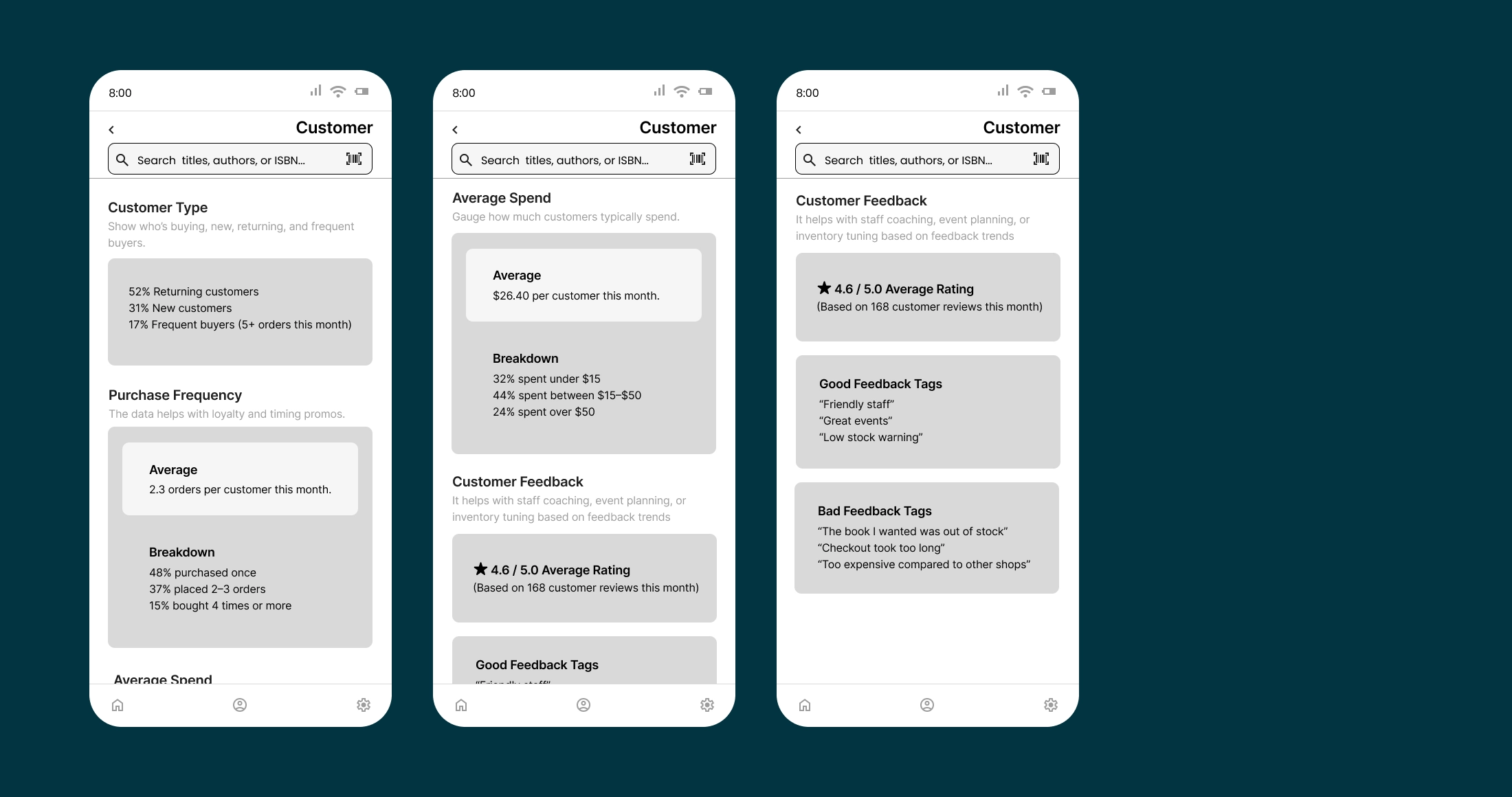
- Customer Insights: I organized insights around four dimensions: Customer Type, Purchase Frequency, Average Spend, and Customer Feedback. The first three quantify behavior; the fourth adds qualitative context through tagged reviews.
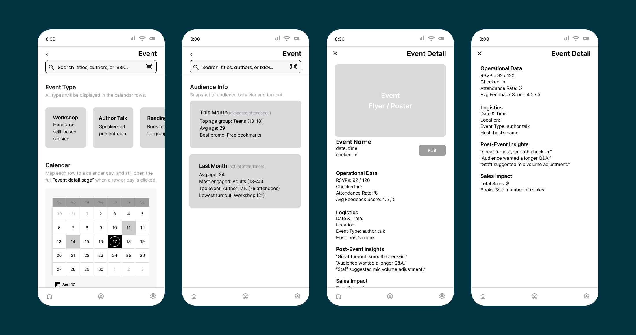
- Event Management: I designed this module as a back-end tool for event marketing and operations, covering planning, attendance tracking, and post-event review.
Outcome
I independently rebuilt the hi-fi design for this case study, building on the team's style guide and original wireframes. What started as a typeface replacement expanded into a broader refinement of the visual system. During prototyping, I noticed the Dashboard's top-right avatar and bottom-right Account tab both led to the same Profile page. Since the avatar carries the user's profile photo and connects directly to the photo-edit option, removing it would weaken that link. Instead, I reassigned it to open a Pending Tasks overlay, surfacing items that need the user's attention.
Hi-fi Walkthrough
The walkthrough below brings the wireframe logic to life in hi-fi, completing each module's flow from end to end.
Reflection
Looking back, the foundation our team built held up well. The style guide, content organization, and four-module structure all carried into the rebuild without needing changes, which let me focus on refinement instead of rework.
One thing I kept thinking about during the rebuild is how the app's descriptive text should be created: the short summaries, status notes, and prompts shown throughout the app. I'm not sure whether they should be auto-generated from data or written by store staff. The answer probably depends on what "useful and efficient" actually looks like for owners and staff day to day, which is something I'd want to learn from spending time in actual bookstores.